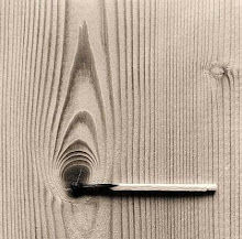
i believe in experience
movement
light
shadow
colour
sound
texture
smell
taste
anything that evokes an emotion, a feeling, a want, a need. Curiosity.
i do not believe an art gallery should be a white box, devoid of natural light. an art gallery should be an artwork in itself, interesting and evocative, yet able to be manipulated.
walk this way
get off the bus outside the Funky Monkey. see my gallery yet? no? keep walking. watch it gradually come into view. it grabs attention without being sensational. it does not break the line of the street, and yet the smooth timber facade, the glass display case, allows the eye to rest from the busy patchwork of shops, signs, windows, advertisements, shapes, colours that make up King Street. take a look at that big sculpture in the window. do you want to see more?
enter through the doorway. pebbles? a transition between the street and the interior. turn left and enter the magazine shop. here you can leaf through magazines, merchandise, and prints. feel free to buy whatever you like.
exit the shop and turn left. step down into the foyer. notice how calm and quiet it is. notice the soft carpet under your feel. take some time to read the displays about what is on. exit the corner into a dark room.
the space is large, dark. ambient sunlight enters through the skylights and stairway on a diagonal in the ceiling. the light reflects and refracts off the glass panel that reach floor to ceiling. artificial lighting shines into the darker corners.
walk around and through the glass panels. study the prints, pages, and covers. take a while to leaf through the books and magazines on the tables. rest on the lounges available, and then walk up the stairs.
notice how the light gets stronger. as you reach the top, look out the window directly in front of you. you can catch a glimpse of sunlight, glimpses the carpark next door, and the road further on. now turn around.
whats that you can see? its a sculpture by Amish Kapoor suspended between the walls, interacting with the walls and the void. it is inhabiting the space. you cant see much of it? thats ok, you may see more later on.
turn left. this is gallery two, where you can see Doris Salcedos work. turn left and you will pass through a series of small spaces where she has installed her art objects; tables, chairs, cupboards filled with concrete. notice how tight the spaces are, how narrow the doorsways are. youre being funneled through. turn the corner to the right and suddenly you can see to the end. that massive installation at the end is my favourite. slowly walk up the gallery, note how the ceiling gradually slopes up to address king street. step up onto the platform. feel free to walk in and around the sculpture. look out the window into the display case and you can see whatever is inside it from above. look, you can see king street through the glass.
turn back around and exit the gallery to the left. pass the stairs into gallery 3. this space is currently holding work by Ata Bozaci. notice the floor covering. it isnt concrete anymore, its asphalt. notice how the windows have no glass. notice how big they are. notice how you can hear sounds of the street, smell food and coffee from the cafe, and the air from the city. does it not make sense, to be able to hear, feel, and smell all these elements, permeating from the outside, when you view the urban, sometimes dark and gritty, work of Bozaci?
take a while to through through the art. note the strong light from the sharp diagonal of the room. notice the artwork residing in the light, how its silhouette is thrown on the floor. look out the window and you can see Kapoors artwork again, but this time from above. reach out the window and you can almost touch it.
now exit through the lift.
what is the first thing you see? through the glass, that massive sculpture by Chen Wenling. see how it is encased by the glass walls, but is open at the bottom, and how it almost reaches the whole height of the building? its as though the sculpture is made specifically for this space. lets go up to my apartment.
when you exit turn left. this is my courtyard, where i can stand and view my domain. this gallery was all created by myself, its like my kingdom and i love it. i can open up my living room and stand here in the day, look out over the sculpture, and out onto the park and the street. i can smell the coffee from the cafe and hear people talking, and yet im above it all enough for it to feel private. would you like a coffee? lets go down.
as you go down you can see the sculpture from the top to the bottom. you exit at the sculptures feet, and if you look up, you see how the size of it is emphazied by the glass surrounding it. the cafe is just to your right, take a seat. we can have functions in this space as well.
so what do you think?


